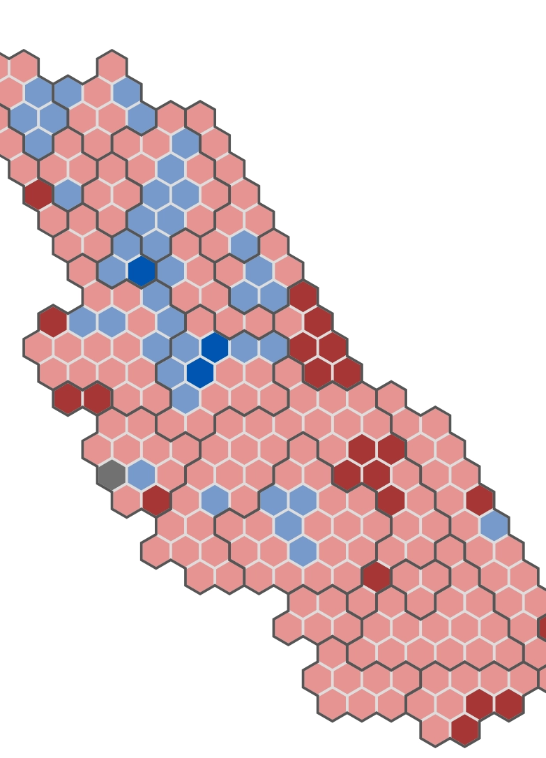
Cartogram developed with svg and d3.js showing the electoral data visualization for Mexico's 2024 elections.Click to visit the website
2021 elections visualization
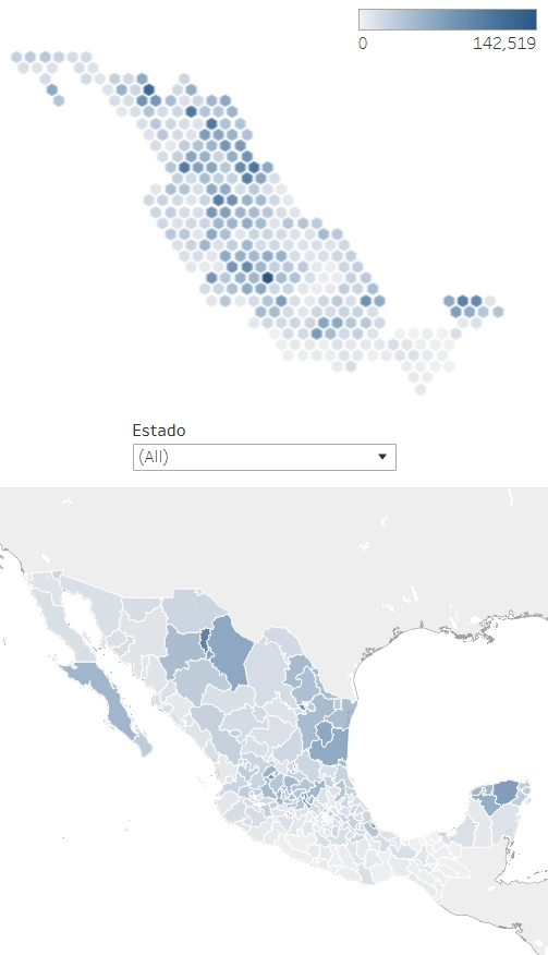
Cartogram and choropleth developed in Tableau and showing the electoral data visualization for the three main parties in the 2021 Mexican deputy elections.Click to see it
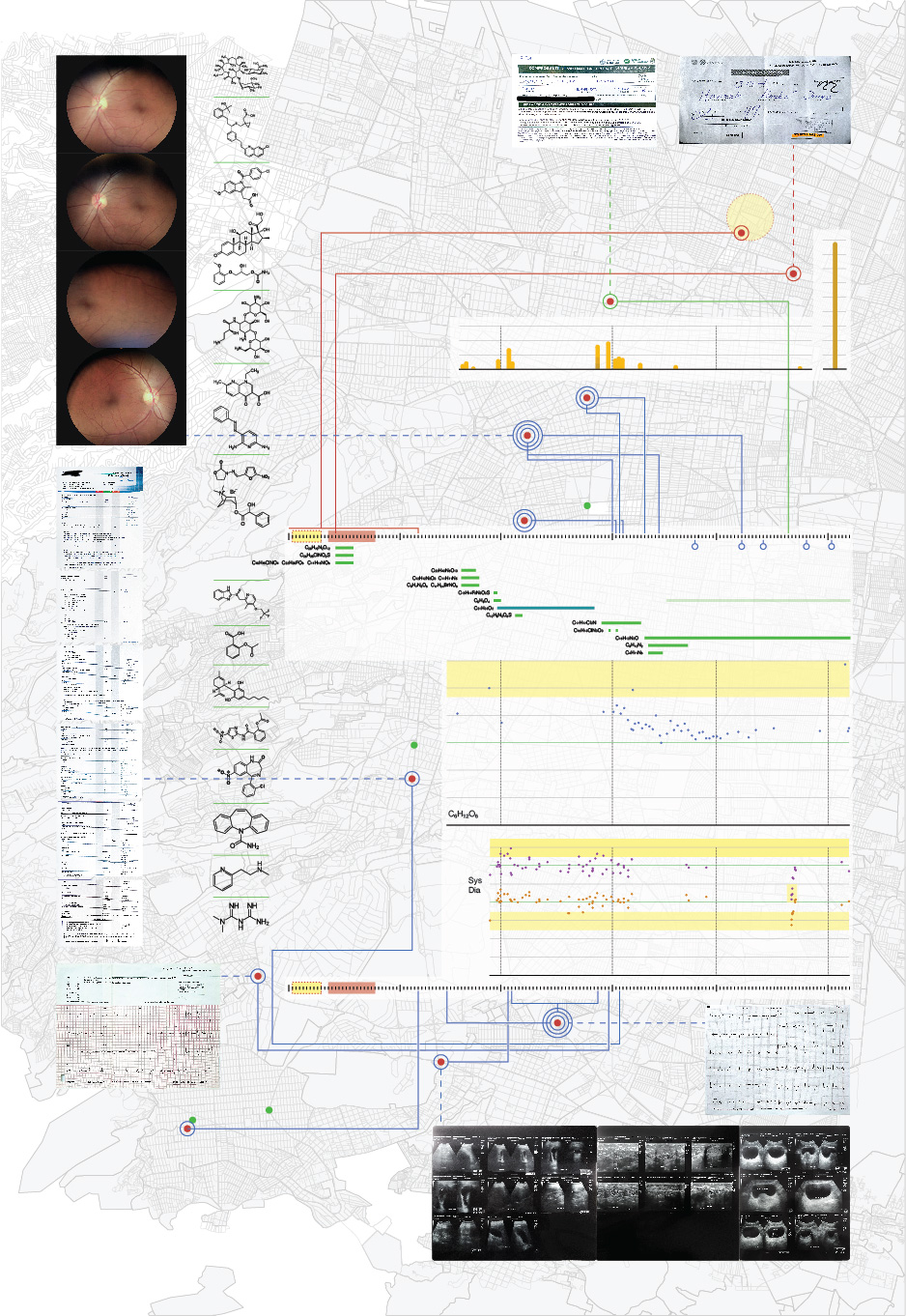
Roto Post-Covid
A piece of data visualization about my health in 2021 from January to June, including my SarsCov infection.Click to see it
Mexican-American war
Masters degree project at Central Saint Martins in London, MACD MA Communication Design. Included in the Directorio de Diseño Mexicano 2012 edited by Centro and ProMexico.Click to see it
Milenio DataLab
Data Journalism. This is the work I've made during my time working for Grupo Milenio. Information design, storyboards, illustrations.Click to see it
Sinacem
Infographic depicting the amount of students enrolled in the SINACEM system and the languages they speak.Click to see
Article 19
This infographic poster is showing the violence against journalists in Mexico between 2006 and 2010. Article 19.Click to see it.
Otros
Information Design, UX/UI, Editorial Design, Logo Design, Illustrations. All made in the last few years.Click to see
Tamaulipas, las carreteras de la muerte.
Information design for a Journalism project, interdisciplinary team. Periodistas de a pie asociation. First place, multimedia category Premio Rostros de la Discriminación "Gilberto Rincón Gallardo" 2016.Click to visit the website